Logos are the chief visual component of a company’s overall brand identity. The logo appears on stationery, websites, business cards and advertising. For that reason, it is essential to take the time to ensure that your logo is perfect and that it gives the right impression. This week’s Ads Gone Bad is going to display a few examples of companies that did not give the proper attention to ensure that their logo is giving their company a good impression. Please enjoy, Logos Gone Bad!
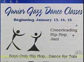
At one glance, it’s a cute picture of a pair of dancers. And then you take notice to the silhouette formed by the black lines…and it’s just ruined, that’s all I can see now!
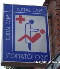
Not sure what this is supposed to look like, but it doesn’t take much of an imagination to figure out what it actually looks like.
Now, this isn’t the first dentist’s office logo that I’ve seen that looks a little, um, naughty. Apparently it’s just difficult to depict a dentist with a patient without looking this way…
…see, I wasn’t kidding.
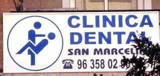
And this again. How do these people not see what their logo looks like?
We hope you have enjoyed this installment of When Ads Go Bad! If you would like to report of an Ad Gone Bad, people contact us at info@transformationmarketing.com.
Note: We are a marketing firm, not a law firm. We are not aware of any copyright laws we may be violating by posting pictures of advertisements that are in the public domain to this blog. This site is just for fun. If you own the rights to any of the pictures or ads posted and feel that violated your copyright, please contact me and we will remove it. If you want us to fix your marketing mishap we can do that too.


