Sports teams do it, fast food chains do it, soft drink products do it and corporate companies do it. Changing your company logo is scary, but almost every company goes through this at least once. (And they survive it!)
The evolution of the logo doesn’t mean the company has changed. It doesn’t mean that your old logo isn’t any good. It simply means that the company is keeping up with the times. Take a look at the photos of our featured companies today. Their original logos don’t work as well in today’s world, do they? Heck, some of them don’t work at all in today’s world. Take a look at the different ways some of these logos have changed over the years.
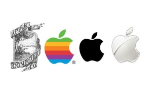
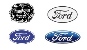
1. Logos have simplified over the years. The original Apple logo is much too detailed. You have to look too close to see what’s going on in the logo. (Sir Isaac Newton under the apple tree immediately before he discovered gravity.) Then, imagine the original Ford logo on today’s cars. It simply wouldn’t work. In today’s fast paced world, people want to know what they’re getting at a glance. They don’t have time to stop and try to figure it out. Therefore, logos need to be simple and easily recognizable.

2. Logos have modified over the years. Many logos have gone from flat to having dimension. Both the Apple and Ford logos have done this in their latest stage of progress.
3. Logos have become more diverse. Logos are being used in more ways than ever. They can be small enough to put on a piece of candy and they can be large enough to put on a billboard. We can embroider them, stencil them, etch them in glass, print them on vinyl signs, have them sized for internet, we can literally put them on almost anything. Because of this, your logo has to be diverse. You have to have the different files to be able to make your logo and large or small as you want and it has to be simple enough that you can do this and still get the full effect no matter what your logo is going on.
4. Logos have become more aesthetically pleasing. In the beginning of design, we didn’t have the tools and experience we have now. We were more restricted with what we could do. Some of the original logos for these sports teams, for example, come off looking a lot like the clip art we see now. Your logo doesn’t have to look like clip art. We have the tools now to make it look like your very own brand, which is exactly what it should be!
Alright, so have we convinced you yet? Or are you still worried about the release of your new logo? We understand. It can be scary! (We’ve been there.)
There are two ways you can release your new logo. You can do it quietly and slowly begin integrating your new logo through your website, products, etc. This works great when you’ve made smaller modifications to your logo and you don’t want to make a big fuss about it. Or… You can do it with a BANG and “release” your new logo. You can do this through media coverage, blogs, social media, your website, a special event, etc. This works great if you’ve made a big change to your logo and you want to make sure that everyone knows that this new design is still the old you, improved.
So, there you have it! Changing your logo is really not that scary, now is it? Contact Transformation Marketing today to see how we can help you modify your company logo. The times, they are a-changing and we encourage you to take that leap.
800-618-1215


