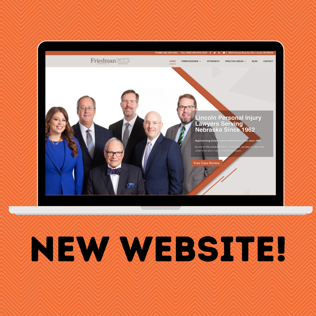
 During Q4 of 2020, we got the awesome opportunity to build a website for one of our long-time clients, Friedman Law Offices. This was incredibly exciting for our team at Transformation Marketing, as well as, the team at Friedman Law. In the past, we have discussed building a brand new website for them, but the timing was never right. After careful planning and multiple designs, we were ready to start building out their new site.
Website building is always an exciting time because when you’re starting from scratch, there are endless possibilities. We knew we wanted the site to be modern, easy to use, and look professional. Our in-house graphic designer got to work and came up with some truly incredible things.
First off, we wanted to make sure that the brand voice and colors for Friedman were consistent across the whole website. On their outdated website, the voice wasn’t always the same on every page. A law firm is a professional company, so fixing that was an incredibly important part. Our team of copywriters and content creators were able to get together and brainstorm ideas for what their content should look like. There were three main questions that we asked ourselves when trying to determine the brand voice.
- • Who was the audience that we were speaking to?
- • How do we want to be portrayed to that audience?
- • What would someone from the outside expect to see when visiting our website?
Once we had answers to these questions, we got to work crafting the content. Each page needed to have enough cohesive information that if it were to be the only page on the website, people could understand it. One of the ways that this was accomplished was by condensing the top navigation bar. On their previous website, there were nine separate navigation links that led to various areas of the website. We have condensed that down to six on their new site, therefore making it less cluttered and allowing each page to have more content.
Another thing we overhauled was the way people interacted with the website. One of our goals was to make the website more user-friendly, so our graphic designer created icons for all of the various practice areas. Each icon can be clicked on to learn more about that specific practice area. A menu drops down with a small blurb of information and if someone chooses to learn more, they can by clicking the “learn more” button.

